A transparent pricing page is arguably one of the most important elements of any B2B website. But many pricing pages do not convert well, leaving marketers scratching their heads and wondering why. In many cases, the answer is simple it’s the design. A good-looking, attention-grabbing, and easy-to-navigate pricing page will impress even the most reluctant leads.
“I’ve run research-driven A/B tests for dozens of SaaS businesses over the past five years, and by far the most common interaction from the home page is to the pricing page. It routinely blows everything else away, including login from existing customers. Every heat map, Google Analytics funnel, and behavior recording I’ve analyzed points strongly to broad, perpetual interest in how much a service costs. How public you are about your pricing is one of the most important decisions a software business can make,” explains a marketing expert from Draft, Nick Disabato.
And the design of your pricing page should always be in concert with your pricing strategy. Because there is a relationship and a dynamic market between price, the value and the volume. The design is actually a way for you to execute the strategy because the very design is what helps you gain and drive the attention of the users.
Read on for a list of design-minded principles that can take pricing page to new heights.
Keep It Simple.
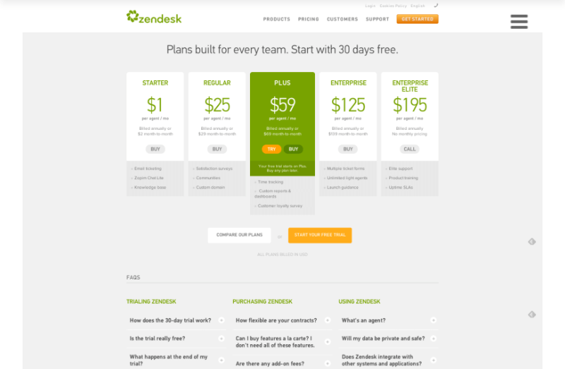
First and foremost, the pricing page shouldn’t be complex. If a lead has found him or herself on your pricing page, chances are they already understand the basic premise of your tool and aren’t looking to be educated or entertained. All this page needs to do is provide pricing information—preferably on a white or at least single color background that makes it easy to read—and convince visitors to move onto the next step: conversion.
ZenDesk has a famously simple pricing page and users across the world find it easy to use and understand.
Highlight Key Features.
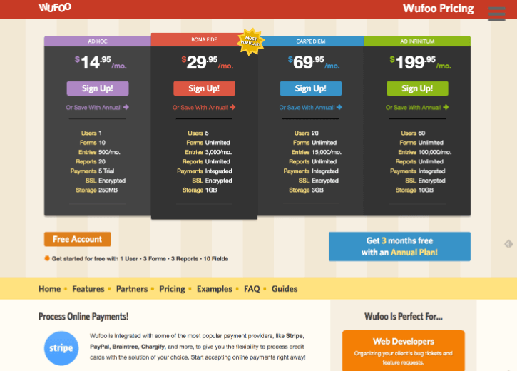
Though visitors will typically have a basic understanding of the purpose of your tool, your pricing page is a good place to remind them of the specific benefits that your tool provides. For instance one or two features with a free or trial plan, but six or more high-quality features with a premium plan. This matters. Add a list of features of each plan.
Here is an example by Wufoo; while the lists are not very different in size, the words, such as “unlimited,” or the larger numbers on more expensive plans clearly show the difference.
Show the Benefits.
While stating the features is useful, prospects tend to rely on benefits your product brings them more—it’s the timeworn What’s In It For Me, or WIIFM philosophy. So, add a few sentences which describe specifically what your tool can do for them—can it improve their efficiency, productivity, quality of work, automate tasks and so on.
Prospects will understand this even without you telling them, but it makes for a far more compelling pricing page if you include this section.
“Pricing pages that were both informative and actionable inspired confidence in users—they were equipped and ready to make a decision. Those that overwhelmed users with information and didn’t provide a clear course of action, intimidated users. Those that were clearly actionable, but didn’t inform, distracted users. Finally, those that were neither informative nor actionable left users feeling discouraged,” concluded The SaaS DNA Project research.
State the target audience
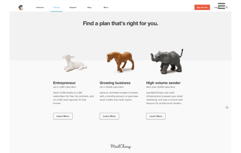
One of the best techniques for selling and representing prices is to clearly state which pricing plan works for whom. For instance, your basic plan may work for startups and small businesses, your medium plan works for growing companies while your premium plan works for enterprises.
When the prospect is on your pricing page, he can specifically locate his or her plan and make a decision easily, without weighing in the features and prices. This makes the process much easier for them and more profitable for you. Check out how Mailchimp executes this strategy…
Add Good-Looking Visuals.
Pricing pages should never be cluttered. However, some visuals that touch on just the right points while looking good and attractive can be useful. For one, use bold colors for details on your pricing plans. Emphasize the plan which brings the most value—this technique can indicate to the viewer which plan to buy. Add an image to each plan.
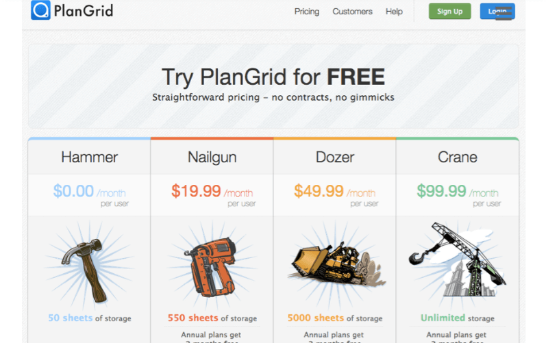
For instance, start with a simple image with your free plan and add more details to it as you move towards the pricier plans. The images should illustrate how their business would improve with plans that cost a bit more. You can even use an animation for your “best value” plan in order to draw attention to it
PlanGrid does this with their fantastic tools illustration, moving from a simple hammer for the cheapest plan through more complicated tools as plans get pricier.
“While simplicity is the best way to go, some visuals can’t hurt. For instance, you could add a few illustrations or icons to your plans, to help them show what their value is. You can also add a feature like a slider to help the users figure out their pricing. Use bold colors but try to do it with taste,” says Tim Arnolds, a content writer at Academized.
Here at Leadfeeder, we’re constantly iterating and improving upon our pricing page. To make the page more interactive, we added a sliding pricing scale to show prospects how traffic, pricing, and lead quality are intrinsic for calculating value.
Include Social Proof.
Social proof is a big deal to customers. For instance, in 2013, 79 percent of online consumers surveyed trusted online reviews as much as personal recommendations, according to a study by SearchEngineLand. And as much as 85 percent of people read reviews for local business. However, some social proof on your page can nudge them in the right direction.
Stay away from stock photo faces and generic reviews and focus on real people, possibly social media posts or video testimonials.
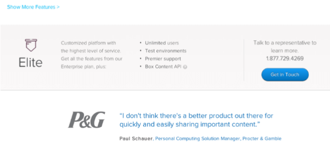
Box, for instance, uses quotes from high-profile clients for their pricing page as a way to increase validation.
Highlight a Specific Plan.
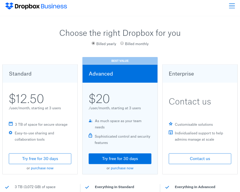
This is a familiar technique a lot of brands are using. They state their basic, good and best plans and make one of them stand out with color or shading effect. This is the best plan, according to their or the public’s opinion. This technique is known to be very beneficial to companies because users usually opt for that one, unless they came specifically for the others. CLX institute performed a study where they concluded that no matter what order your pricing plans are in, the users will focus on the highlighted plan for longer.
Dropbox does this, as well. In their case, we have a simple, minimalistic pricing page where the only thing that stands out is their “best value” plan. This immediately draws your attention and it makes this option more compelling than the other two.
Tools To Help You Go From Zero To Hero…
Grammar and spelling matter a lot on a pricing page, and let’s face, any other part of your site obviously. Everything else might look great, but a spelling or grammar mistake signals to your customers that you’re a bit sloppy. It’s human psychology. A worthy brand will pay attention to things like grammar, et al.
Here are some tools that can help you with your pricing page to prevent such glaring errors…
StateOfWriting and MyWritingWay - As already stated, grammar is a really important factor. Focus on eliminating mistakes with these two resources.
Spelling is also something to keep in mind. Other than being repulsive, it can also cause some confusion. Use these proofreading tools, recommended by Writing Services.
To remove repetition and redundancies from your pages, use these tools, praised by BoomEssays.
Offer a Free Trial.
Free trials became a norm—and that’s a good thing for those who like to give products a test drive before committing. It gives the user a chance to feel your program out a little bit, to play with it and get used to it. After a free trial, the user will likely love it so much that they will but it, no questions asked.
Surprisingly even though 44 percent of companies use a free trial as their marketing strategy, SaaS businesses report that more than 80 percent of free trial sign ups never move on to being paying customers. This may make you question the validity of the free trial strategy, right?
However, focus on building a good conversion strategy for all the free trial sign ups. Email marketing along with quality of products and excellent support services can all play a big role in increasing your trial to paid rates, as well as high-touch customer success and superb onboarding processes.
Conclusion
Setting up a good pricing page isn’t easy as there are a lot of elements to consider. Make sure that you are transparent and clear about your prices and features that come with them—and choose your strategy wisely. However, with some of these tips in your toolkit, and a dash of design style and creativity, you’ll soon have a page that converts.
Now that you're here
Leadfeeder is a tool that shows you companies that visit your website. Leadfeeder generates new leads, offers insight on your customers and can help you increase your marketing ROI.
If you liked this blog post, you'll probably love Leadfeeder, too.
Sign up


