The internet has a love-hate relationship with the popular growth marketing tactic, exit-intent pop-ups. Some folks love them, while others think they should be left in the late 90s, along with glitter fonts and auto-play music.
That's because when pop-ups were first introduced, they were annoying. They were obtrusive, covered the whole page, and impossible to close. Lame.
Luckily, times have changed — and so have our pop-up strategies.
For starters, Google cracked down on pop-ups that interrupt the user experience. Also, marketers realized using pop-up triggers is far more effective than showing every visitor the same pop-up at the same time.
At Leadfeeder, one of our favorite triggers is exit intent. We've had a lot of success converting visitors to leads using this strategy.
Note: Leadfeeder identifies B2B site visitors even if they don't fill out a form. Sign up for a free trial and see who is creeping on your website.👀
What is an exit-intent pop-up?
Exit-intent pop-ups are triggered overlays that display when users move to leave a website. In most cases, they're triggered by the user moving their mouse to the URL bar or the exit button of their browser.
Their goal is to give users a reason to stay on your site or prompt them to share contact info so you can connect with them later.
And, according to Wisepops, exit-intent pop-ups convert 5 percent better than traditional pop-ups, which makes them worth testing.
Do exit-intent pop-ups work for B2B marketing?
Absolutely. While there are tons of strategies for using them in B2C (abandoned cart recovery or promoting sales, for example), they can be incredibly effective in B2B marketing as well.
Here's why — the B2B sales process keeps getting longer, making it challenging to stay connected to prospects and push them through the funnel. Plus, standard lead generation strategies aren't as effective as they used to be.
Using exit-intent pop-ups can improve lead qualification and help B2B businesses gather more leads.
Examples of B2B exit-intent pop-ups
Let's see what these look like in action, shall we?
This first one is from OptinMonster, a popular pop-up tool (go figure!):

There are a few things that work with this pop-up.
For starters, it uses color and bold text to draw your eyes to the most important content. They also include a bit of social proof by mentioning they're the #1 pop-up tool.
It also focuses on how easy the tool is to set up — that's likely a pain point customers have mentioned.
Notice that bar at the top? It shows you're already halfway done. They also mention it's easy to set up.
The CTA is a little cheeky, which might annoy some users, but it's part of their branding, so it works well.
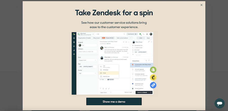
This exit pop up from Zendesk aims to convert high-intent visitors by displaying when you exit their pricing page:

Rather than prompting users to download the tool or sign up for an email list, this pop-up pulls users through the funnel by encouraging them to watch a demo.
The visitor has already visited their pricing page, so they assume (rightfully) the visitor is close to conversion.
The pop-up design is simple but shows the dashboard to entice users to give it a try.
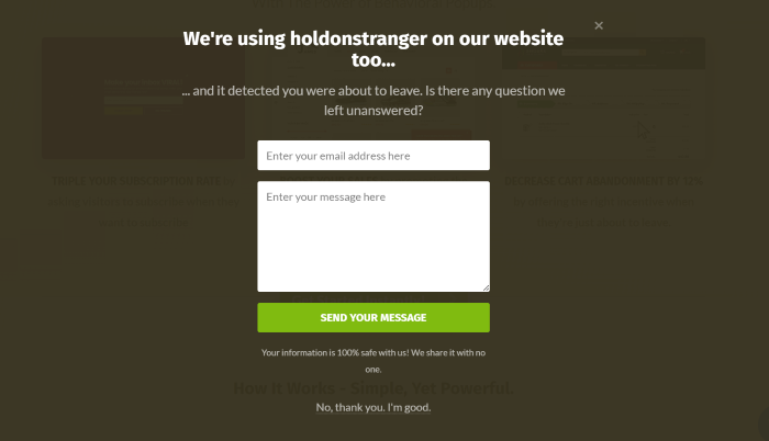
Here's another exit-intent pop up from a site called holdonstranger:

This one is a lot simpler. They do use color to draw your eye to the CTA button, but there's no social proof, and it doesn't try to convert users directly.
Rather, it asks if the visitor has a question and prompts them to send an email. They're gathering emails so they can nurture high-intent customers later.
Leadfeeder’s highest performing exit-intent pop-ups (and why they work!)
We've been testing exit-intent pop-ups here at Leadfeeder, and we want to share our results — including what works and what doesn't. Let's take a look at our top four exit pop-ups.
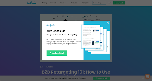
1. "ABM checklist" exit-intent pop-up
Account-based marketing drives a ton of traffic for us. We've created quite a bit of content around this term, including guides and videos.
This checklist is a distilled guide to successful ABM:

Why it’s performing well:
Short content: Most companies focus on longer content, thinking users find longer content more valuable. We found the opposite — short, concise content that breaks down a complex task performs really well.
Actionable: This isn't a long guide or an "everything you need to know." That's because we're targeting users a little further down in the funnel — they are already using ABM or already know they want to and need a little extra help. It's concise and actionable.
Relevant: The offer is related to the article topic but a bit more specific and narrowed down by targeting both B2B and ABM.
2. "Cost-Per-Lead" exit-intent pop-up
Our cost-per-lead calculator helps salespeople calculate their CPL. It's a major pain point for many salespeople, so this solution is pretty well received.
The pop-up is displayed on pages related to sales and has a pretty impressive conversion rate of 3 percent.

See more: https://www.leadfeeder.com/blog/cost-per-lead-calculator-and-formula/
Why it’s performing well:
Useful: It’s a tool that solves a problem our audience has.
Nice search volume → good traffic: It's used on pages with high search volume, so it reaches a large number of our visitors.
Relevant: The tool name corresponds directly to the article name.
We saw the same results with our sales plan template, which earns a 6 percent conversion rate. Overall, we've found templates and tools work really well!
3. "B2B lead generation guide" exit-intent pop-up
Our B2B lead generation guide is one of our top downloads. So, we decided to turn it into a pop-up.
Here's what it looks like on our site:

See more: https://www.leadfeeder.com/blog/generate-more-sales-leads/
Why it’s performing well:
Evergreen topic: This topic consistently does well and people constantly look for this type of content.
Thorough: The guide covers a ton of lead generation topics. Not all strategies are relevant for every company, so offering more options makes it useful to a broader audience.
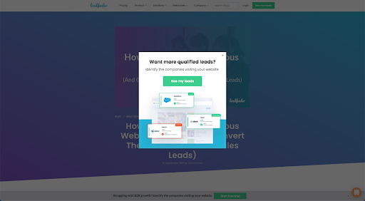
4. "Sign up for Leadfeeder" exit-intent pop-up
The last example we tested is a pop-up pushing blog visitors to sign up for Leadfeeder. This one does push for a direct conversion, but it's only used on content that is showing some kind of intent.

See more: https://www.leadfeeder.com/blog/how-to-identify-anonymous-website-visitors/
Why it's performing well:
Focuses on benefits: This pop-up focuses on the value it delivers by using strong, direct language. Users know what to expect; all they have to do is click.
Only used on product or transactional pages: In addition to using exit-intent triggers, this pop-up only displays on high-intent pages. We aren't trying to convert users who read one article; instead, we want users further down the funnel.
When exit-intent pop-ups don't work, turn to Leadfeeder
Exit-intent pop-ups help recover site visitors before they leave your site. But, with an average conversion rate in the single digits, there are still plenty of people leaving your site despite your best efforts.
That's where Leadfeeder comes in! Using a data-driven demand generation strategy of IP and location info, we help identify which companies are visiting your website. We'll even show you what pages they visit and how often they return.
Note: Ready to see your leads? Sign up for a free, 14-day Leadfeeder trial.
More leads, no forms.
Sounds too good to be true? It’s not. Identify companies already visiting your website and turn them into qualified leads to fuel your sales pipeline.
Show me how


