The average website conversion rate is just over two percent.
That means for every 100 people who visit your website, two will actually take whatever action you're aiming for.
Two.
Now think about much you spent to get those 100 people to your website. 😬

It's a tough world out there.
The good news is there are ways to increase your conversion rate, but you need to know what strategies work and which ones don't.
Today, I'll share my top conversion rate tips so you can bump those numbers up. Who doesn’t love a strong list of leads from their website?
Here's a quick conversion rate optimization checklist; we'll cover more on each point in the sections below:
Use personalization
Add social proof
A/B test CTAs
Optimize headings
Use pop-ups carefully
Update previously high-converting pages
Get rid of distractions
Note: Looking for more leads? Leadfeeder helps businesses turn companies visiting your website into leads. Sign up for a free 14-day trial and see what they are interested in.
Leverage website personalization
Personalization means using data about who your site visitors are and what actions they take on your site to create a custom site experience.
And it's incredibly effective-51 percent of brands that use personalization reported an increase in conversion rates.
One of the best things about personalization is you can use it as much or as little as you want.
For example, you can create entirely unique home pages for different customer profiles, like Biz Base does by creating one home page for tech professionals:

And a second home page for those in upper management:

Or, you can keep it simple by using custom pop-ups or recommending relevant content based on actions users have taken on your site.
Add social proof
In high school, we all wanted to be like the cool kids, right?

Maybe not everyone.
The point is, we still want to know that other people have used and approved of an item or service before we buy.
That is why social proof is so effective. Simply adding social proof to your website can boost conversion rates by 15 percent or more.
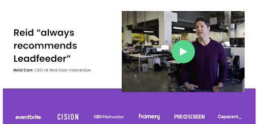
For example, on the Leadfeeder site, we added video reviews at the bottom of every page:

These videos help people feel confident that our tool will deliver. The inclusion of logos from brands that use our tool establishes trust.
Bonus tip: Consider adding personalized social proof based on site behavior. For example, showing HR reps reviews from other HR reps is much more effective than showing them reviews from CMOs.
A/B test your CTAs
Calls-to-action are your time to shine. It's when you tell site visitors to take the next step and convince them to follow through.
But, there's a good chance your CTAs suckkkkk.
In fact, the average CTR for CTAs is around 4 percent.

Too many acronyms aside, A/B testing helps you find out what types of CTAs work best for your audience.
And, it's not just about choosing the right words — images, videos, and even anchor text can all impact the effectiveness of CTAs.
Consider adding personalization to your CTAs as well. A Hubspot study found that personalized CTAs perform 202 percent better than generic CTAs.
Optimize your headings
The vast majority of internet users only read headings. The exact number varies, but it's somewhere between 60 and 70 percent of users, depending on the study.
In fact, Upworthy accidentally published a headline with no actual article and it went viral in just a few hours before it was taken down. There was literally no article at all, and yet 2,000 people still commented and argued — from the heading alone.
Some people will read your content, but the vast majority won't make it past the headline.
This means your headlines need to be not just good, but great.
If you want to improve your conversion rates, make sure your headings and titles are optimized, catchy, and to the point. Consider A/B testing different headlines to make sure you put your best headlines out front.
Just getting the headlines right can increase conversions by 52.8 percent.
Use pop-ups carefully
I have a love-hate relationship with pop-ups.
On one hand, they tend to work.
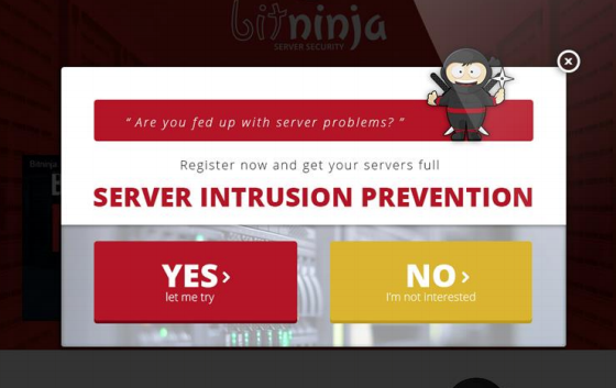
BitNinja, a B2B startup, managed to increase its conversion rates by 114 percent by adding a pop-up.

On the other hand, I get annoyed by pop-ups that cover the content or hide the exit icon, so it's best to use pop-ups intentionally.
Here are a few tips for increasing conversion rates with pop-ups without annoying your visitors:
Use a trigger that activates pop-ups when consumers complete a specific task (like reading a blog post or staying on a page for 15 or more seconds)
Make the pop-up easy to close
Reduce form fields in pop-ups so, they’re easy to fill out
Update previously high-converting pages
If there's one thing that stays the same in marketing, it's that everything changes. Google updates its algorithm, user preferences change, and technology gets updated.
What worked last month or even yesterday won't necessarily work today. That means there's a good chance your previously high-converting web pages are now languishing at the bottom of your analytics report.
Use Google Analytics to compare your highest converting pages month over month or year over year. Once you have a list of all your awesome pages that are now major losers, make a plan to update them… stat.
Be sure to:
Optimize headings
Update broken links
Add new stats
Add new internal links
Check your page speed
Update outdated content
Spending just an hour or two of time updating older posts can bring your content back from the dead. In fact, Hubspot managed to double their leads and increase organic traffic by 106 percent just by updating old content.
Get rid of distractions
Have you ever visited a website and been confused about what to do next? There are pop-ups, banners, and chatbots all vying for your attention.

While those features can help increase conversions, too much of a good thing can have the opposite effect.
Your site (and your landing pages) need to be clear and to the point. Stay focused on what you need visitors to know and what you want them to do next.
Heat map and user testing tools can help you find what is pulling users off your conversion path so you can keep your site (and your visitors) focused.
Final thoughts
The reality is, there is no one right way to increase website conversions, but this list will get you started. Test each strategy and see what happens. Your conversion rates — and your bottom line — will thank you.
Now that you're here
Leadfeeder is a tool that shows you companies that visit your website. Leadfeeder generates new leads, offers insight on your customers and can help you increase your marketing ROI.
If you liked this blog post, you'll probably love Leadfeeder, too.
Sign up


